Back to workService design · Case study
Starbucks Case Study
Starbucks coffee shops are ubiquitous. Most people enjoy drinking unique taste. However, sometimes people have to wait for a long queue and they might get wrong coffee when the staff call their name. Our team realized that we should improve shopping experience in order to maintain happy environment.
Problem & Situation
- If the queue is too long, people feel annoyed or start to do other things, such as using smartphone and chatting with friends.
- There are too many people on the weekend. Thus, we observe that people see each other in front of desk when their name is called and consider whether they get the certain coffee by themselves.
The understanding of user’s reactions

Ideation
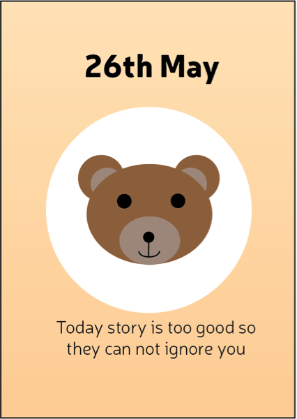
My idea is that I design a daily story paper for everyone to read when they enter Starbucks and they will get a story from different types, such as science & fiction and romantic story.
App Solution
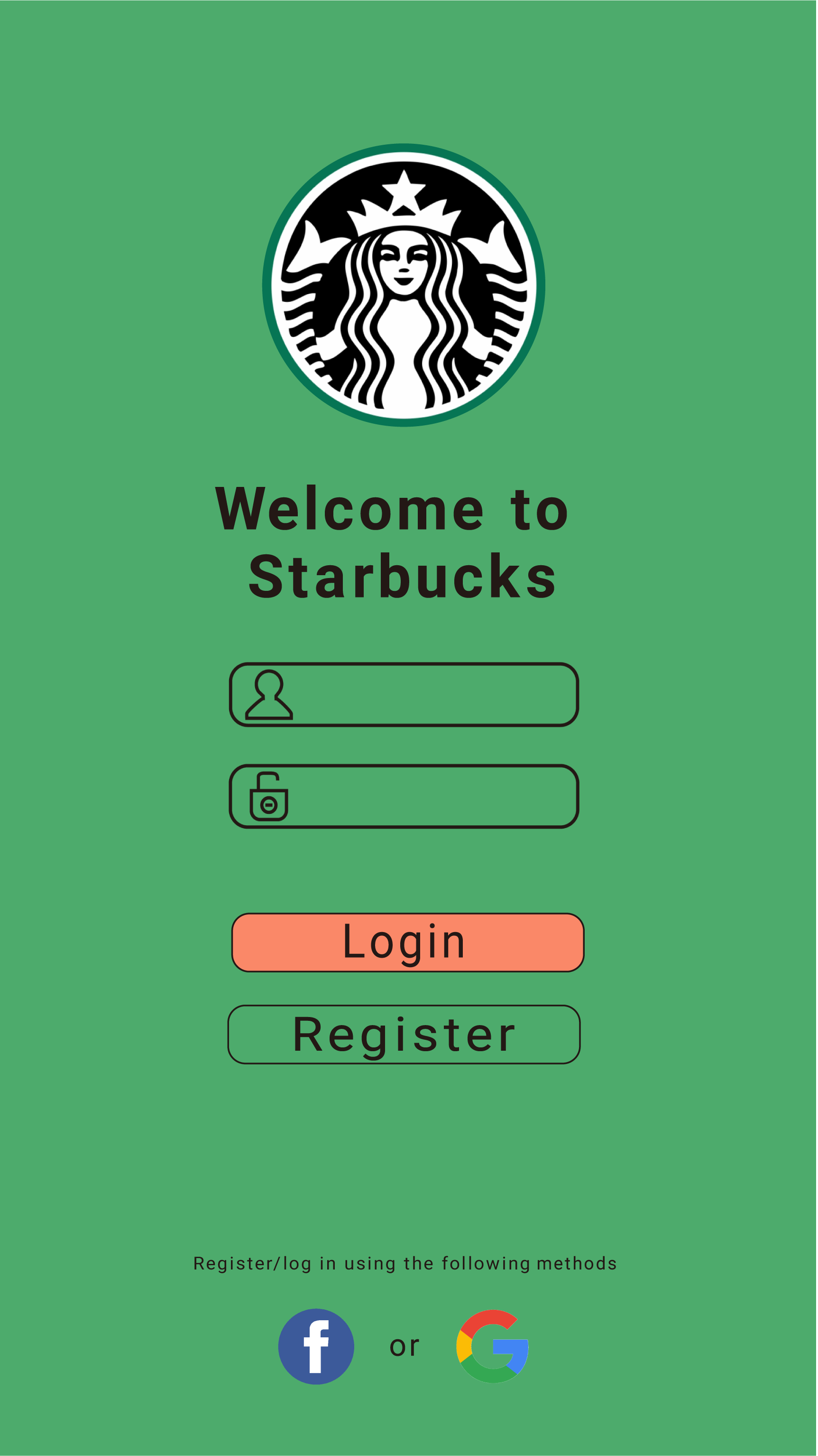
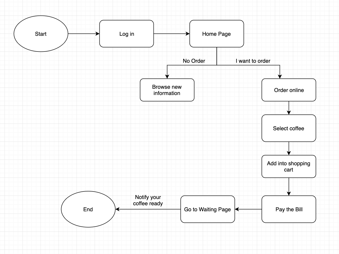
My team decided to make an App so most people are able to access it on the go.
User Flow
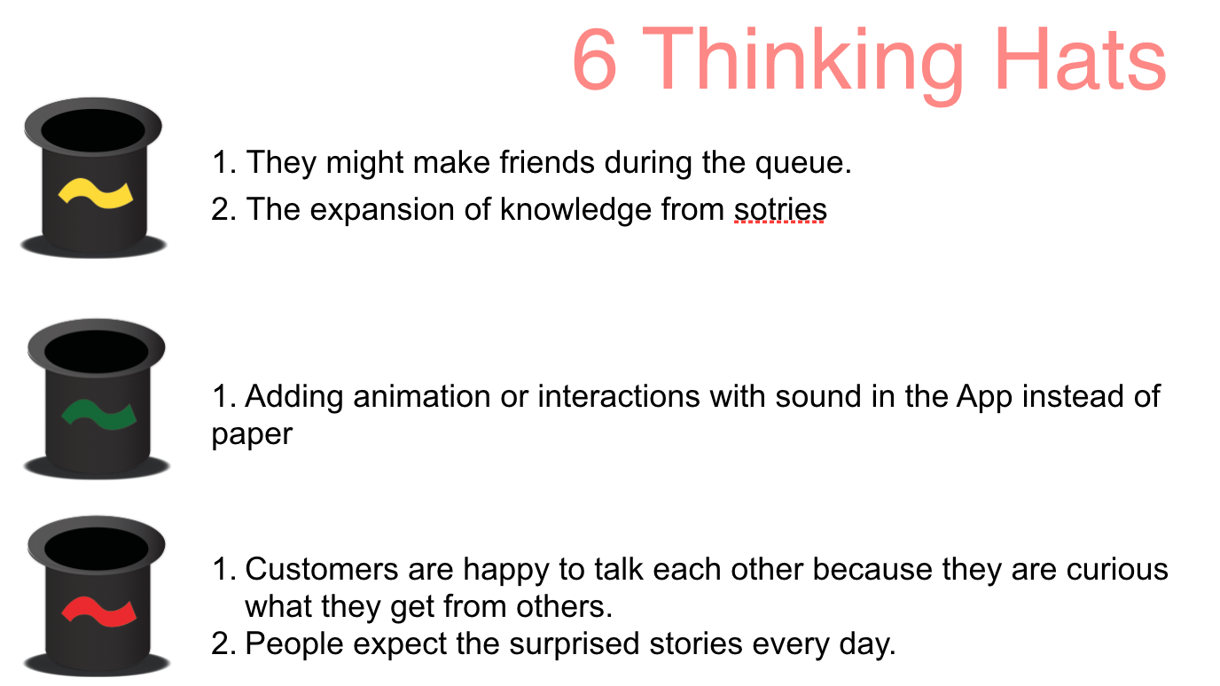
Classification hat
User Test Record
How Our App Works
Summary
Test Feedback
- Users see the “Log in” page but cannot read the font; on the Home page they struggle to differentiate “mean” and “order online”, and don’t know how to go back.
- The order page is too narrow; items are crowded and the “32” indicator is unclear.
- The hamburger menu does not work.
Next Steps
Iterate on typography, increase spacing between actions, and rework the navigation so users can recover from mistakes more easily. Validate again with a fresh round of usability tests.